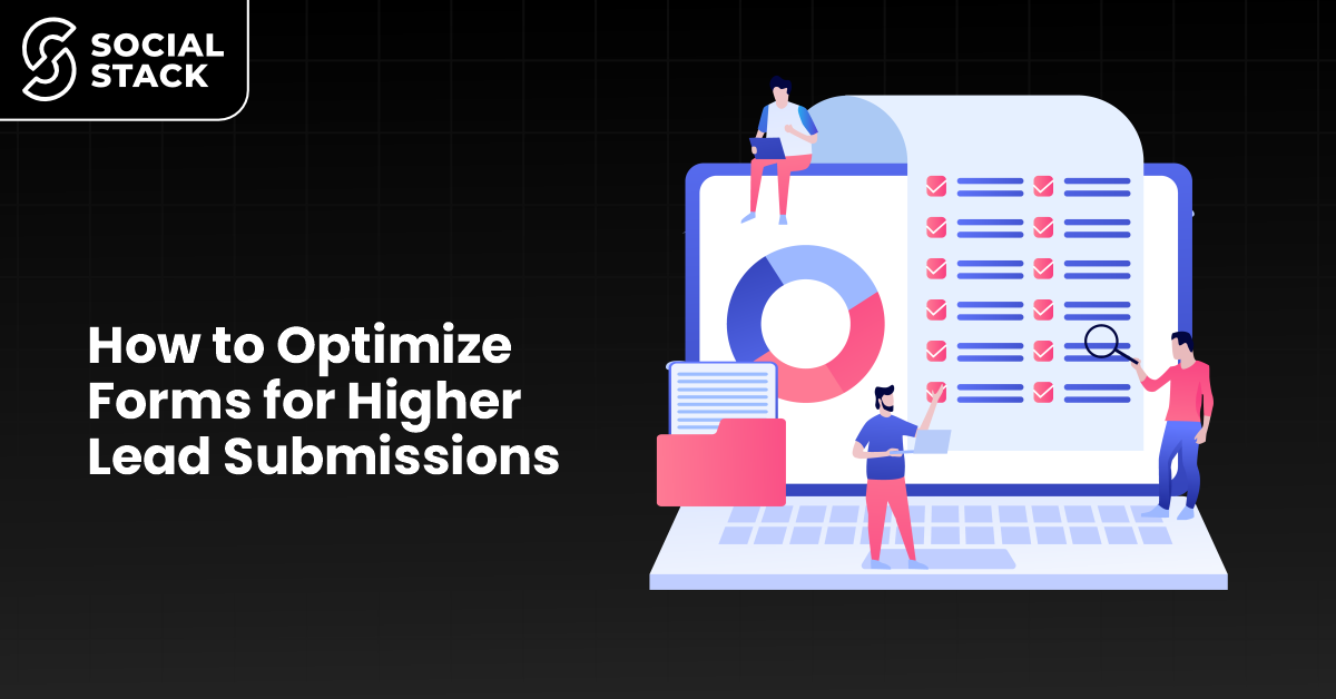
How to Optimize Forms for Higher Lead Submissions
Riya stared at her dashboard in disbelief.
Her website's traffic was increasing every week. Ads were performing well. Social media engagement seems to be healthy. Yet her leads hardly moved. She discovered a frustrating issue: visitors were departing after filling her signup form.
No errors. There is no crash. Just abandonment.
If this sounds similar, you aren't alone. Many businesses make significant investments in traffic generation yet miss one of the most important conversion points: their forms. A poorly designed forms can quietly waste opportunities, while a structured one can convert casual visitors to qualified leads.
That is where form optimization becomes a powerful growth lever. When done correctly, it lowers friction, builds trust, and makes filling a form seem effortless rather than tedious.
At The Social Stack, we have personally see how even small changes to form and structure can significantly increase conversions. In this guide, you'll learn practical, proven strategy to optimize forms to capture more leads while maintaining user experience.
Why Form Optimization Matters More Than You Think
Most businesses regard forms as a final step, a simple data collection tool. In reality, your form functions as a conversion gateway. Every extra field, confusing label, or moment of pause gives consumers an excuse to abandon.
Effective form optimization involves reducing cognitive load while maximizing clarity and trust.
Well-optimized forms help you:
- Increase completion rates
- Reduce form abandonment
- Get higher-quality leads
- Improve user experience
- Boost brand credibility
Think of it like this: if visitors are the fuel, your form is the engine that converts it into measurable growth.
Understanding Why Users Abandon Forms
Before applying form optimization tips, it's helpful to understand the psychology behind abandonment. Users rarely quit without a reason. Common friction points include:
Overwhelming length
Long forms cause decision fatigue. Visitors begin to question whether their efforts are worth it.
Lack of clarity
Ambiguous labels or unclear instructions create hesitation.
Privacy concerns
If users don’t understand why information is requested, trust drops.
Technical friction
Slow loading times, poor mobile responsiveness, or validation errors discourage completion.

When you design these behaviors in mind, you can create high-converting forms that are intuitive and respectful of the user's time.
Core Principles of High-Converting Forms
1. Ask Only What's Matters
Every field should justify its existence.
If information isn’t vital for initial contact, delete it. Shorter forms reduce form abandonment because they feel quick and doable.
A good rule:
- Start with the essentials
- Gather additional details later
- Use progressive profiling when possible
This approach is consistent with modern lead generation best practices, in which trust is built gradually instead of being demanded immediately.
2. Use Clear, Conversational Labels
Labels should be read like natural prompts, not database fields.
- Instead of:
"Contact Identifier"
- Use:
"Your Email Address"
Clarity reduces hesitancy and keeps the user moving. Simple language is a powerful but often overlooked form optimization method.
3. Optimize for Mobile First
Most users interact with forms on mobile devices. If the experience is cramped or clunky, abandonment increases.
Mobile-friendly, high-converting forms should include:
- Large tap targets
- Minimal typing requirements
- Autofill compatibility
- Logical field spacing

Mobile optimization is not optional; it is essential to modern lead generation best practices.
4. Reduce Visual Friction
Design influences perception. Clean layouts, clear structure, and whitespace help people focus. Avoid clutter that competes with the form's goal.
Effective form optimization tips include:
- One clear call to action
- Consistent typography
- Visible progress indicators in multi-step forms
A visually calm interface reassures users that the procedure is simple.
5. Build Trust Within the Form
Trust is often the hidden conversion factor.
Add subtle credibility signals:
- Privacy reassurance text
- Security badges
- Testimonials nearby
These factors encourage users to complete the form instead of questioning your intentions.
Trust-centered design is quite effective in reducing form abandonment, especially for sensitive data requests.
Structuring Forms for Better Completion Rates
Single-Step vs. Multi-Step Forms
Multi-step forms can feel less scary when breaking them down into digestible sections. Instead of confronting users with a long list, you guide them through manageable steps.
Benefits include:
- Reduced perceived effort
- clear progress visualization
- Higher engagement
When properly built, multi-step flows support high-converting forms while not overwhelming users.
Smart Defaults, Autofill
Pre-filling fields when appropriate saves effort and signals thoughtful design. Even minor conveniences help to build momentum, which is necessary for successful form optimization.
Inline Validation
Instant feedback prevents frustration.
Instead of submitting & discovering multiple errors, users fix issues in real time. This keeps the process running smoothly and lowers abandonment.
Behavioral Psychology Behind Form Optimization
Great forms do more than just gather data; they also guide behavior.
Commitment momentum
When users finish the first field, they're more likely to continue. Simple opening questions generate momentum.
Loss aversion
Progress indicators tap into our natural tendency to finish whatever we start.
Cognitive ease
When decisions feel easy, conversions rise.
These psychological cues encourage lead generation from best practices by matching design with human behavior.
Advanced Form Optimization Strategies for More Leads
Once the essentials have been set, advanced improvements can improve performance even further.
A/B test fields
Test:
- Field order
- CTA wording
- Button placement
Even small changes have an impact on conversions. To decide whether shorter forms or multi-step forms convert better, you can apply principles like those in our guide on A/B Testing in Marketing to systematically compare variations.
Conditional logic
Display only relevant fields depending on user responses. This keeps forms short and focused, which is a proven strategy for reducing form abandonment.
Microcopy that reassures
Short helper text reduces uncertainty:
- Why you ask for information
- What happens next
- Privacy reassurance
These small touches improve trust and usability.
Measuring Form Performance
Optimization without measurements is guesswork.
Track:
- Completion rate
- Drop-off points
- Time to completion
- Mobile vs desktop performance
Analytics identify friction points, allowing you to refine tactically.
Continuous monitoring ensures that your form optimization efforts evolve according to user behavior.
Real-World Impact of Optimized Forms
Businesses that prioritize high-converting forms often report:
- Increased lead volume without extra traffic spend
- Improved user trust
- Higher engagement
- Better funnel efficiency
Form improvements increase with time. A 10% increase in conversion rate can result in significant long-term growth.
This is why expert partners, like The Social Stack, focus not just on attracting visitors, but also on optimizing every conversion touchpoint, including forms, to enhance performance.
Recommended Resources for Further Learning
For deeper insights on lead generation best practices, check out:
- HubSpot's guide for form conversion optimization
- Moz articles on UX and CRO
- Neil Patel's conversion-focused design insights
These resources add to your ongoing form optimization strategy.
If you're also planning content to drive more qualified traffic to your optimized forms, your guide on Creating a Winning Social Media Calendar can help you stay consistent.
Bring It All Together
Optimizing forms isn't about tricks or shortcuts. It's about respecting the user's time, reducing friction, and enabling visitors to take confident action.
When you:
- Simplify fields
- Improve clarity
- Design for mobile
- Build trust
Apply behavioral psychology
...you design a smooth experience that naturally increases submissions.
The difference of an abandoned form or a completed one is frequently determined by thoughtful design choices.
And this is where expert advice has a tangible influence.
Final Thoughts: Turning Forms into Growth Engines
Riya did not need more traffic. She needed better conversions.
After implementing targeted form optimization tips, her completion rate improved. Leads increased. Her funnel finally mirrored the effort she had put into marketing. Your forms can do the same.
If you want to transform underperforming forms into highly profitable forms that continually drive growth, working with specialists accelerates the entire process. The Social Stack assists businesses by applying proven lead generation form best practices, improving user experience, and reducing form abandonment through data-driven strategies resulting in real results.
Are you ready to transform your forms to lead magnets? Partner with The Social Stack to start optimizing when conversions actually happen.
.png)